|
» GC Stats |
Members: 329,725
Threads: 115,665
Posts: 2,204,971
|
| Welcome to our newest member, vitoriafranceso |
|
 |
|

02-10-2008, 05:38 PM
|
|
GreekChat Member
|
|
Join Date: Jun 2005
Location: Huaco
Posts: 699
|
|
|
Yes, change the font. There are less intricate old English-type scripts out there--you've just got to find them. Google "free font downloads" and see what you come up with.
Some cute (OK, maybe a bad word to use about a fraternity shirt, but oh well) graphics on the back would be cool. Maybe have a couple people sitting in chairs on the beach looking out over the ocean with leis hanging on their chairs (think Corona's commercials here) and then "Everyone gets lei'd / date" above them in the sky of the beach theme, and then frame the back graphics with a couple of palm trees.
Have fun with this. See if there's an artsy brother who'd want to help or if t-shirt company who's printing them has a graphic designer on staff. There are soooo many great graphics you could come up with that relate to the Corona theme there. As a girl, the more intricate fraternity shirts are the ones I like to wear...and re-wear...and re-wear....thus boosting your fraternity's visibility on campus via girls wearing your stuff.
Good luck!
__________________
Your mother was a hamster and your father smelt of elderberries!
|
02-10-2008, 08:01 PM
|
|
GreekChat Member
|
|
Join Date: Dec 2007
Location: Potbelly's
Posts: 1,289
|
|
Quote:
Originally Posted by Stef the Pef

Yes, change the font. There are less intricate old English-type scripts out there--you've just got to find them. Google "free font downloads" and see what you come up with.
Some cute (OK, maybe a bad word to use about a fraternity shirt, but oh well) graphics on the back would be cool. Maybe have a couple people sitting in chairs on the beach looking out over the ocean with leis hanging on their chairs (think Corona's commercials here) and then "Everyone gets lei'd / date" above them in the sky of the beach theme, and then frame the back graphics with a couple of palm trees.
Have fun with this. See if there's an artsy brother who'd want to help or if t-shirt company who's printing them has a graphic designer on staff. There are soooo many great graphics you could come up with that relate to the Corona theme there. As a girl, the more intricate fraternity shirts are the ones I like to wear...and re-wear...and re-wear....thus boosting your fraternity's visibility on campus via girls wearing your stuff.
Good luck!
|
Thank you, this is the kind of advice I was seeking. I'm gonna scrap the whole thing and go with some sort of Hawaiian lettering, I was inspired by the pro bowl today. I think that it would be much more appealing to sorority girls if I scrap the corona/ old english font and go with something more "fun." The "everybody gets lei'd" tagline is set in stone by the committee so I might as well stick with the Hawaiian-ish stuff and maybe try to find a hawaiian/ flowery font.

|
02-25-2008, 04:51 PM
|
|
GreekChat Member
|
|
Join Date: Feb 2008
Posts: 2
|
|
|
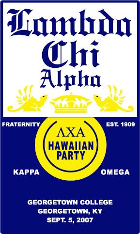
corona design
Here is a shirt I created for some Lambda Chi's with essentially the same theme. They looked great when they were finished. I agree with the above...I am very anal whenever I design anything and it has to be as close to perfect as I can come up with. I enjoy doing it though....My art is always free if someone uses me for printing.
Last edited by Eyerish; 02-26-2008 at 11:23 AM.
|
02-25-2008, 04:57 PM
|
|
|
Quote:
Originally Posted by Eyerish
Here is a shirt I created for some Lamda Chi's with essentially the same theme. They looked great when they were finished. I agree with the above... I am very anal whenever I design anything and it has to be as close to perfect as I can come up with. I enjoy doing it though....My art is always free if someone uses me for printing.

|
You do realize that "LAMBDA" *IS* misspelled, right? 
|
02-26-2008, 12:36 AM
|
|
GreekChat Member
|
|
Join Date: Sep 2007
Location: location, location... isn't that what it's all about?
Posts: 4,206
|
|
Quote:
Originally Posted by OTW
You do realize that "LAMBDA" *IS* misspelled, right? |
You beat me to it! Not only is it missing the "b", but the a looks like an o. On first glance, I saw "Lomda". The artwork is free, eh? Shocking, with such quality and all.
|
02-26-2008, 11:21 AM
|
|
GreekChat Member
|
|
Join Date: Feb 2008
Posts: 2
|
|
OOPS. Well the final version was spelled right...I added the wrong file...it has been updated.  Lovely...you never get a second chance to make a first impression right? I assure you...that I can spell Lambda...and if I am too dumb to spell it.....someone in the chapter would catch it before the sign off on it.
As for the A that looks like an O....it is the Corona font....If they want a corona design...you can't really blame the artist on Corona's font choices.
|
02-10-2008, 08:22 PM
|
|
GreekChat Member
|
|
Join Date: Dec 2007
Location: Potbelly's
Posts: 1,289
|
|

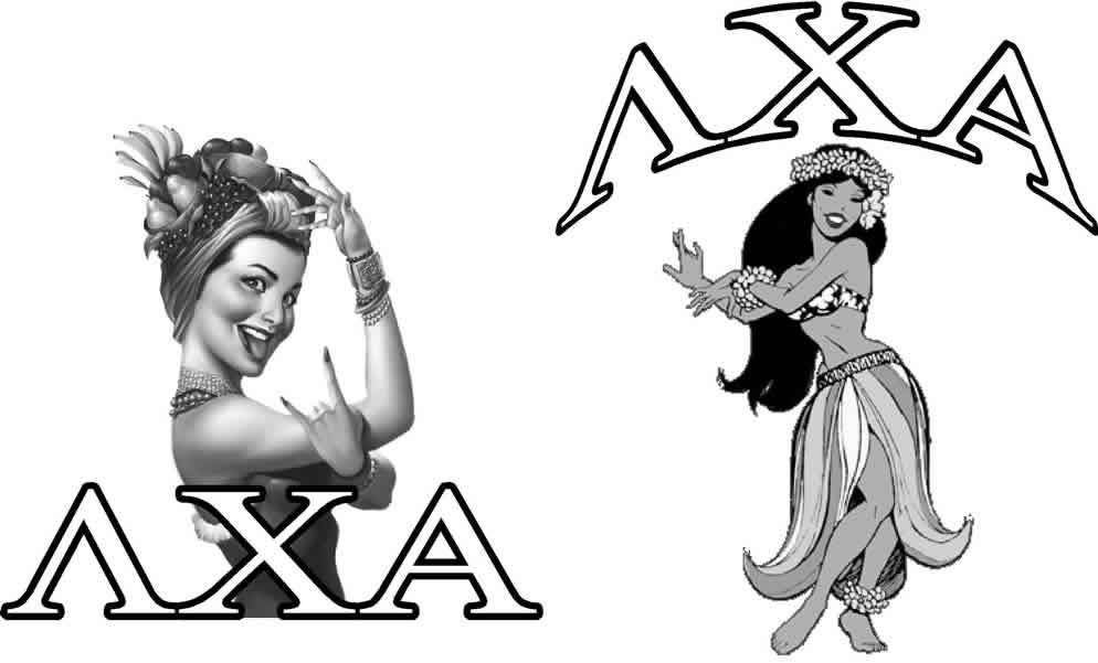
Attempt #2
|
02-10-2008, 08:44 PM
|
|
GreekChat Member
|
|
Join Date: Sep 2007
Location: yankeeheathenland
Posts: 719
|
|
Why do I always think of Red Dwarf whenever I check this thread???
|
02-10-2008, 08:41 PM
|
|
GreekChat Member
|
|
Join Date: Jun 2005
Location: Huaco
Posts: 699
|
|
I like attempt #2! Is there any way to make the flowers in the lettering a lighter color so "FIJI Islander" stands out a little more, though?
The lei hanging off the bottom is cute, too. I liked that in the last version and I like it in this one.
__________________
Your mother was a hamster and your father smelt of elderberries!
|
02-10-2008, 08:45 PM
|
|
GreekChat Member
|
|
Join Date: Mar 2006
Posts: 1,991
|
|
|
I really like this font! It's much more tropical and consistent with the theme.
|
02-10-2008, 09:48 PM
|
|
GreekChat Member
|
|
Join Date: May 2007
Location: Florida
Posts: 1,622
|
|
|
I like both designs, but I agree that the first was hard to read "Fiji". I think the first design, with a font change, would be great for brothers' shirts, but I think the second design would be better for sorority shirts. I absolutely love the second design, hence why I think it would be best for sorority shirts.
__________________
"A Kappa Alpha Theta isn't something you become, its something you've always been!"
|
02-10-2008, 09:47 PM
|
|
GreekChat Member
|
|
Join Date: Jul 2007
Location: Out in Left Field
Posts: 7,544
|
|
|
Typically, if you are mixing colors darker colors are "background" colors and lighter colors are in "forward" colors for emphasis. Also, you are losing color in the lei. Can you put some brighter colors in it or make the outline heavier?
(sorry, I work with marketing people everyday, and they argue about "just the right color of grey")
__________________
When did GC become Twitter?
|
02-10-2008, 09:53 PM
|
|
GreekChat Member
|
|
Join Date: Dec 2005
Posts: 1,648
|
|
|
Could the letters that make up the words "FIJI Islander" be a cobalt or dark bright blue while the leaves behind the letters be a kelly green? Then the wording will be more prominent.
__________________
....but some are more equal than others.
|
02-10-2008, 10:34 PM
|
|
GreekChat Member
|
|
Join Date: Dec 2007
Location: Potbelly's
Posts: 1,289
|
|
|
What I'm working on now is making the flowers alternate between pink and green, its coming along really well but its taking a good deal of time.
|
02-11-2008, 06:27 AM
|
|
GreekChat Member
|
|
Join Date: Jul 2004
Location: Indianapolis, IN
Posts: 671
|
|
|
Just a suggestion, but I'd definitely use a different font than the Comic Sans you used for the date of the event. It looks too 3rd-grade teacher-ish. (Personally, I can't STAND Comic Sans because it's so overused.)
I really like the other font, though!
__________________
|
|
|
| Thread Tools |
|
|
| Display Modes |
 Hybrid Mode Hybrid Mode
|
 Posting Rules
|
You may not post new threads
You may not post replies
You may not post attachments
You may not edit your posts
HTML code is Off
|
|
|
|


