|
» GC Stats |
Members: 333,842
Threads: 115,761
Posts: 2,209,001
|
| Welcome to our newest member, zjamstivanov776 |
|
 |
|

11-14-2009, 11:57 AM
|
|
GreekChat Member
|
|
Join Date: Jan 2009
Posts: 1,799
|
|
|
Hehe, this thread makes me chuckle. When I'm home for breaks I see a fair amount of burberry letters (I'm talking about you Hofstra SAE!!). But I guess that's just how it is up here - I shudder to think of all the tacky guido Delta Chi letters are running around that campus. And for the record, if you're a guy with patterned letters I'm judging you.
__________________
"Delta Chi is not a weekend or once-a-year affair but a lifelong opportunity and privilege"
- Albert Sullard Barnes
|
In Preparation For GreekChat Going Members-Only:
Please Be Sure To Do This
11-14-2009, 12:11 PM
|
|
Moderator
|
|
Join Date: Sep 2000
Location: Hotel Oceanview
Posts: 34,587
|
|
|
OMG -GUYS with designer patterned letters? That's beyond guido, I don't even know of a word for that. One of my guy friends had plaid letters and I thought even that was pushing it.
__________________
It is all 33girl's fault. ~DrPhil
|
11-14-2009, 12:19 PM
|
|
GreekChat Member
|
|
Join Date: Jan 2009
Posts: 1,799
|
|
Quote:
Originally Posted by 33girl

OMG -GUYS with designer patterned letters? That's beyond guido, I don't even know of a word for that.
|
Ahh, but you forget this is Strong Island. When we become our own state there will even be a law mandating excessive guido-ness. ")
__________________
"Delta Chi is not a weekend or once-a-year affair but a lifelong opportunity and privilege"
- Albert Sullard Barnes
|
11-14-2009, 06:12 PM
|
|
GreekChat Member
|
|
Join Date: Jul 2009
Location: Somewhere, PA
Posts: 200
|
|
|
Unfortunately, I saw a guy in Sig Pi walking around with Burberry letters just this week. Wish I was kidding.
__________________
ΔΣΠ
AΦ
"If you find the girls that love the you, you love..well then that's just fAbulΦus."
|
11-14-2009, 07:11 PM
|
|
GreekChat Member
|
|
Join Date: Dec 2003
Location: only the best city in the world
Posts: 6,261
|
|
Quote:
Originally Posted by Gusteau
Hehe, this thread makes me chuckle. When I'm home for breaks I see a fair amount of burberry letters (I'm talking about you Hofstra SAE!!). But I guess that's just how it is up here - I shudder to think of all the tacky guido Delta Chi letters are running around that campus. And for the record, if you're a guy with patterned letters I'm judging you.
|
Quote:
Originally Posted by Gusteau
Ahh, but you forget this is Strong Island. When we become our own state there will even be a law mandating excessive guido-ness. |
LMAO. Hofstra is hardly bastion of fashion forward-ness, especially when it comes to letters.
and SI is really New Jersey the Annex. i refuse to let it be considered part of NYC with all that "guidoness".
and on the top of patterned letters: ive actually come around on patterns. Ive seen some really cute ones (polka dots, stripes) but ive seen some gross/unnecessary ones. like the Sammies at Brooklyn College with Mets logo-print letters. really guys?
__________________
Do you know people? Have you interacted with them? Because this is pretty standard no-brainer stuff. -33girl
Last edited by tld221; 11-14-2009 at 07:15 PM.
|
11-14-2009, 07:25 PM
|
|
GreekChat Member
|
|
Join Date: Jan 2008
Location: nasty and inebriated
Posts: 5,783
|
|
Quote:
Originally Posted by tld221
and SI is really New Jersey the Annex. i refuse to let it be considered part of NYC with all that "guidoness".
|
I resent that. We have our own Guidos to deal with.
Quote:
|
and on the top of patterned letters: ive actually come around on patterns. Ive seen some really cute ones (polka dots, stripes) but ive seen some gross/unnecessary ones. like the Sammies at Brooklyn College with Mets logo-print letters. really guys?
|
Patterns seem to be most common with women I noticed. Though some of the TKEs at my school use them. I've seen some ridiculous ones like dollar signs. Speaking for myself though, I wouldn't mind a set of Yankee pattern letters.
__________________
And he took a cup of coffee and gave thanks to God for it, saying, 'Each of you drink from it. This is my caffeine, which gives life.'
|
11-15-2009, 12:56 AM
|
|
GreekChat Member
|
|
Join Date: Jan 2009
Posts: 1,799
|
|
Quote:
Originally Posted by tld221
LMAO.
and on the top of patterned letters: ive actually come around on patterns. Ive seen some really cute ones (polka dots, stripes) but ive seen some gross/unnecessary ones. like the Sammies at Brooklyn College with Mets logo-print letters. really guys?
|
EXACTLY! What's wrong with getting letters in blue and orange (or gray and blue for fans of the WORLD CHAMPIONS) - translatable into real life and appropriate in sports settings. I equate sports t-shirts with twelve year old boys, so sports logo letters just seem very juvenile to me.
__________________
"Delta Chi is not a weekend or once-a-year affair but a lifelong opportunity and privilege"
- Albert Sullard Barnes
|
11-16-2009, 04:40 PM
|
|
GreekChat Member
|
|
Join Date: Dec 2005
Posts: 1,650
|
|
|
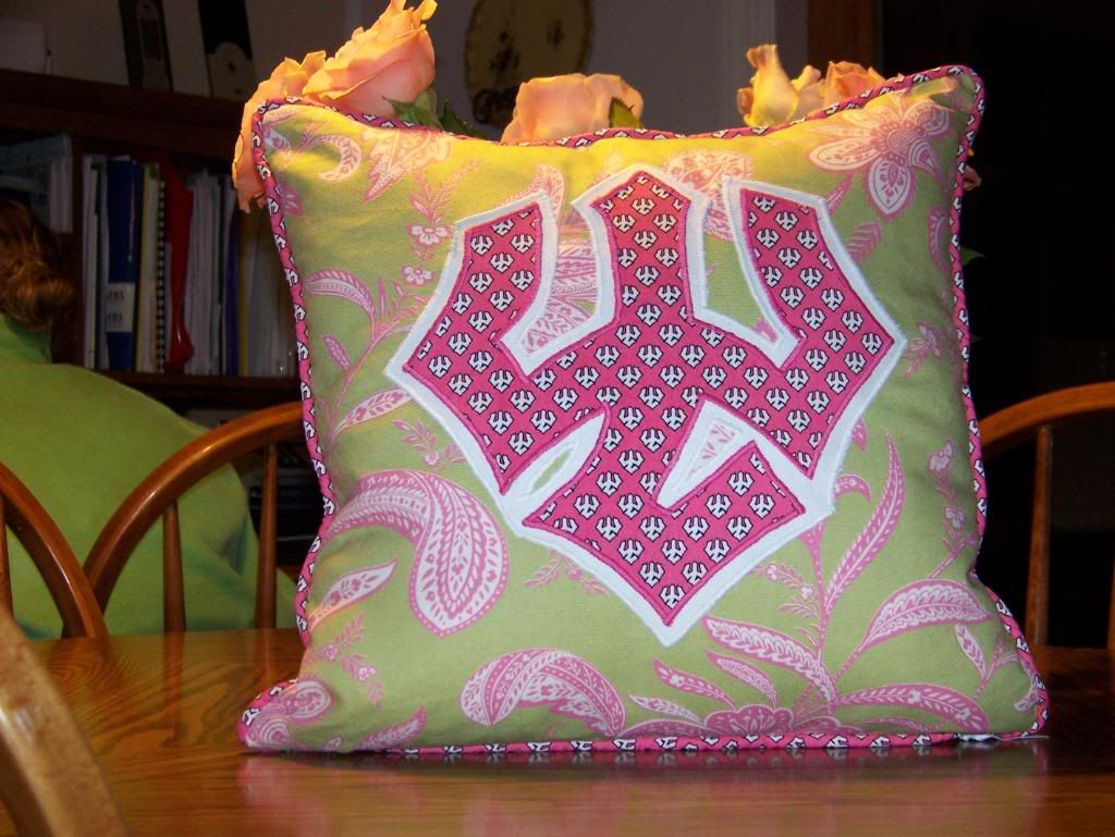
I have a commission for pillows for a client's 3 sons and one of the son's girlfriends. The client wants the pillows to have the college symbol on one side and their greek letters on the other.
For Son1 and the GF (they both attend the same school), she bought 2 pairs of the college-specific Vineyard Vines lounge pants in different colorways for me to use for the letters.the logo, and pillow piping. Son2's pillows will have his college symbol in the exact colors of the school and his letters and piping in school-color plaid. Both boys and the GF attend colleges where the fraternity members rarely wear stitched-letter shirts around campus. The Greek women do, but to a lesser extent than other places.
Son3 who still in K-12 is not nearly as labor-intensive as he will be getting a pillow made from his school t-shirt and award patches.
__________________
....but some are more equal than others.
|
11-16-2009, 05:03 PM
|
|
GreekChat Member
|
|
Join Date: Dec 2003
Location: only the best city in the world
Posts: 6,261
|
|
Quote:
Originally Posted by alum
I have a commission for pillows for a client's 3 sons and one of the son's girlfriends. The client wants the pillows to have the college symbol on one side and their greek letters on the other.
For Son1 and the GF (they both attend the same school), she bought 2 pairs of the college-specific Vineyard Vines lounge pants in different colorways for me to use for the letters.the logo, and pillow piping. Son2's pillows will have his college symbol in the exact colors of the school and his letters and piping in school-color plaid. Both boys and the GF attend colleges where the fraternity members rarely wear stitched-letter shirts around campus. The Greek women do, but to a lesser extent than other places.
Son3 who still in K-12 is not nearly as labor-intensive as he will be getting a pillow made from his school t-shirt and award patches.
|
that sounds pretty awesome! i'd love one with my school's logo and letters, but there's nothing "go team" about a purple torch and my letters combined.
__________________
Do you know people? Have you interacted with them? Because this is pretty standard no-brainer stuff. -33girl
|
11-16-2009, 05:06 PM
|
|
GreekChat Member
|
|
Join Date: Jan 2008
Location: nasty and inebriated
Posts: 5,783
|
|
Quote:
Originally Posted by tld221
that sounds pretty awesome! i'd love one with my school's logo and letters, but there's nothing "go team" about a purple torch and my letters combined.
|
Though your school does have one of the most recognizable logos I have ever seen. Hmm a highlander combined with Psi U would be pretty badass come to think of it.
__________________
And he took a cup of coffee and gave thanks to God for it, saying, 'Each of you drink from it. This is my caffeine, which gives life.'
|
11-16-2009, 05:15 PM
|
|
GreekChat Member
|
|
Join Date: Dec 2003
Location: only the best city in the world
Posts: 6,261
|
|
Quote:
Originally Posted by Psi U MC Vito
Though your school does have one of the most recognizable logos I have ever seen. Hmm a highlander combined with Psi U would be pretty badass come to think of it.
|
we're the freaking fighting violets. nothing hardcore abuot that. i cant talk smack when all my school's teams are D3 and D4 and our mascot is a flower. or a bobcat, depending on who you ask.
__________________
Do you know people? Have you interacted with them? Because this is pretty standard no-brainer stuff. -33girl
|
11-24-2009, 04:56 PM
|
|
GreekChat Member
|
|
Join Date: Dec 2005
Posts: 1,650
|
|
Quote:
Originally Posted by tld221
that sounds pretty awesome! i'd love one with my school's logo and letters, but there's nothing "go team" about a purple torch and my letters combined.
|
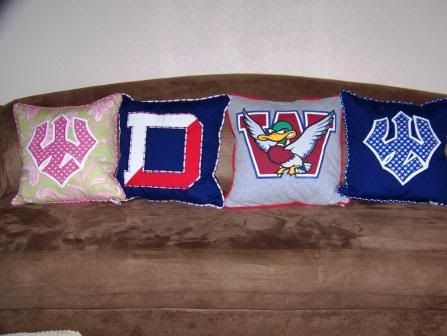
The schools
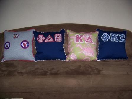
The letters are not centered top to bottom because the client wants to add monograms for each pillow owner.
Blowup of the boxer shorts fabric
__________________
....but some are more equal than others.
|
11-24-2009, 05:56 PM
|
|
GreekChat Member
|
|
Join Date: Nov 2008
Location: Detroit, Michigan
Posts: 2,643
|
|

I think our mascot is really creepy lol. I think it'd look terrible with anyone's letters. Sure it's a Blue Devil but... idk, the 70s porno stache just isn't doing it for me.
ETA: He used to also have an ear ring.. I guess they scrapped that.
__________________
Σ Φ Ε
Michigan Theta SLC
Last edited by pshsx1; 11-24-2009 at 05:58 PM.
|
11-24-2009, 06:43 PM
|
|
GreekChat Member
|
|
Join Date: Aug 2005
Posts: 2,641
|
|
Quote:
Originally Posted by alum
The schools
The letters are not centered top to bottom because the client wants to add monograms for each pillow owner.
Blowup of the boxer shorts fabric
|
I've never seen that symbol....What school is that? What are the other schools, too? I think I must live under a rock..lol
I'd love one with the Penn State Nittany Lion and Phi Mu letters....I know my guy would like one with Otto (Syracuse's mascot) and his Alpha Chi Sigma letters on it....Do you make those for people to buy? I bet you'd make a killing with people (like myself) who have school spirit and love for their GLOs! You are VERY talented!!!
Last edited by als463; 11-24-2009 at 06:45 PM.
Reason: adding
|
11-24-2009, 08:28 PM
|
|
GreekChat Member
|
|
Join Date: Dec 2005
Posts: 1,650
|
|
|
The D is for Denison University. The motif on the t-shirt pillow is a prep school mascot. The Washington and Lee University trident is actually the letters "W" and "L" superimposed on each other.
You should be able to find Penn State and Syracuse fabric fairly easily as many Division 1 big sport schools have licensed fabric for sale. Just make sure the motif is small enough for the design of your applique. The W&L fabrics that I used were pajama pants bought at the college bookstore. With careful cutting, the pants were turned into boxer length shorts and the chopped off legs were able to be used for the applique designs.
__________________
....but some are more equal than others.
|
|
|
 Posting Rules
|
You may not post new threads
You may not post replies
You may not post attachments
You may not edit your posts
HTML code is Off
|
|
|
|


 Linear Mode

