Quote:
Originally Posted by AGDee

Michigan's has similarities to Pennsylvania's...
|
And to the other 20+ "seal on a blue bedsheet" flags. I mean, I certainly understand that people can love and respect these flags, but one has to admit -- when they're hanging from a flag pole and there is no wind, it can be
very hard to distinguish one from another.
Quote:
Originally Posted by BuckeyeTriDelta
The only flag shaped like a burgee in the U.S. (and I think the world but I might be wrong).
|
There are plenty of burgees in the world, but no other that I know of as a national or state/provinicial/departmental flag.
Quote:
Originally Posted by jon1856
But one does have ot wonder if Disney in one way or another is the reason that this is the only flag which was used during the War between the States that the NAACP has not yet protested.
|
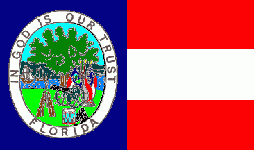
Except that it wasn't used during the Civil War. The current Florida flag wasn't adopted until 1900. This is the flag Florida used during the Civil War:
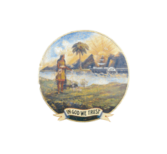
This is the flag Florida used after the Civil War until 1900:
BTW, South Carolina, Virginia and Texas all currently use essentially the same flags they used during the Civil War, and I don't recall any protests about those flags.
Quote:
Originally Posted by Tom Earp
Plain and simple may be the key.
|
Precisely! Like good heraldry, good vexillography (flag design) relies on simplicity and distinctiveness.
Okay, I'm about to get really geeky on all y'all (okay,
more geeky than normal

)
The North American Vexillological Association did
a survey back in 2001 of State, Provincial and Territorial Flags. NAVA members and others were asked to rate flags based on the five basic principles listed in NAVAs publication on flag design,
Good Flag, Bad Flag: How to Design a Good Flag. Those principles are:
- Keep It Simple: The flag should be so simple that a child can draw it from memory
- Use Meaningful Symbolism: The flags images, colors, or patterns should relate to what it symbolizes
- Use 23 Basic Colors: Limit the number of colors on the flag to three, which contrast well and come from the standard color set
- No Lettering or Seals: Never use writing of any kind or an organizations seal
- Be Distinctive or Be Related: Avoid duplicating other flags, but use similarities to show connections
(That publication does note that "All rules have exceptions. Colorado's 'C' is a stunning graphic element. Maryland's complicated heraldic quarters produce a memorable and distinctive flag. But depart from these five principles only with caution and purpose.")
The top ten flags were:
1. New Mexico
2. Texas
3. Quebec
4. Maryland
5. Alaska
6. Arizona
7. Puerto Rico
8. The District of Columbia
9. The Marshall Islands
10 South Carolina (my favorite)
The bottom ten were:
63. New Hamphire
64. Idaho
65. Wisconsin
66. Kentucky
67. Minnesota
68. South Dakota
69. Kansas
70. Montana
71. Nebraska
72. Georgia
Note that all of the bottom ten were flags of the seal-on-blue-field variety. (The Georgia flag at the time was the short-lived
Denny's Place Mat flag, not the current flag.)
Papers all over the country reported on the survey, especially if their own state or provincial flag scored very high or very low.
Again, just because a flag placed low doesn't mean that the flag isn't meaningful to the people of the state it represents -- just that from a design standpoint, it is a less effective design.
As an aside, I've found it interesting to look at some GLO flags with these design guidelines in mind. Two things I note are that many GLO flags differ from most other flags because the symbolism displayed on them often is esoteric and that Greek Letters can functions as symbols as well as "writing/lettering" or the name of the GLO.
Can you tell I'm really interested in flags?


 Hybrid Mode

