|
» GC Stats |
Members: 331,865
Threads: 115,722
Posts: 2,207,936
|
| Welcome to our newest member, zelamaarleyo651 |
|
 |
|

07-13-2006, 10:32 PM
|
|
GreekChat Member
|
|
Join Date: Jul 2002
Location: Dunedin, FL
Posts: 2,112
|
|
|
Wanna vote on something? Do it here!
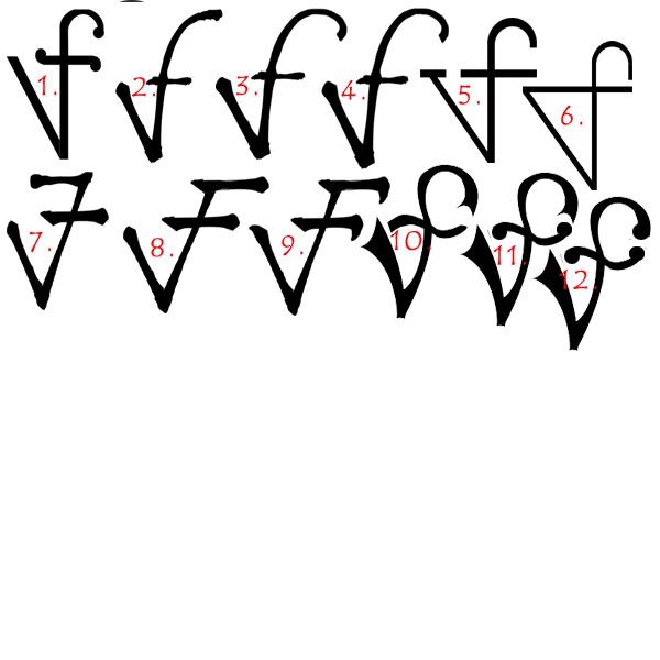
Hey everyone! Below is a collection of logos. What are these logos for you ask? Well, a few of you know that slowly but surely my FI is getting into the jewelry world by using an art twist to his work. The chosen name for his business is "The Vulcan Forge", so there ya go.
We basically want to get an idea of what other people think is attractive, we have our favorites but are curious of what other people think.
So, I'm asking that you just COMMENT on your favorite(s) and (if you can) why you liked it (them).
Please keep in mind that this will be for an ARTISTICALLY-GEARED Jewelry venture.  Oh, and please refrain from the "OMG! YOU'RE LISTENING TO INTERNET PEOPLE! OMG! YOU'RE GONNA GO TO HELL!! OMG!" posts.
Oh, and these are ROUGH sketches....more than likely will go on a stamp than a huge ole' sign.
__________________
Lambda Omicron Psi Alumna
University of Rio Grande
Proud wife of a Rho Pi TKE!
|
07-13-2006, 10:39 PM
|
|
GreekChat Member
|
|
Join Date: Apr 2004
Location: Conshohocken, PA
Posts: 1,150
|
|
|
I would say the ones that caught my eye first are 1, 2, 9, and 10. I really like 9 and 10. I think they've got a nice fancy/artistic look/feel to them while still being clear that it's supposed to be a "v" and an "f".
__________________
SOP
PSimissU
|
07-13-2006, 11:11 PM
|
|
GreekChat Member
|
|
Join Date: Dec 2005
Location: Why? You coming to my house?
Posts: 1,643
|
|
|
10. i dont know why
|
07-13-2006, 11:23 PM
|
|
GreekChat Member
|
|
Join Date: Nov 2003
Location: Watching Janie and Jeff on DanceTV.
Posts: 2,394
|
|
|
3, 9
__________________
Welcome to GreekChat. Sorry so few of us are willing to blow rainbows up your ass. --agzg
|
07-13-2006, 11:33 PM
|
|
GreekChat Member
|
|
Join Date: Jan 2006
Posts: 3,255
|
|
|
I think they are all good, however I would advise that the final logo include the name. I personally find only logos to be less professional. I think the best is when there is a logo, and also the written name. For example, look at Sprint or Southern Company. You might recognize the name or the symbol alone, but they have combined to create the company symbol. I mean, these are major corporations, but I think that is the best strategy for a legitimate, professional look.
|
07-13-2006, 11:34 PM
|
 |
Super Moderator
|
|
Join Date: Nov 2001
Location: Counting my blessings!
Posts: 31,599
|
|
|
3,4 (is there an appreciable difference?) or 9.
__________________
~ *~"ADPi"~*~
♥Proud to be a Macon Magnolia ♥
"He who is not busy being born is busy dying." Bob Dylan
|
07-13-2006, 11:40 PM
|
|
GreekChat Member
|
|
Join Date: Dec 2001
Location: why? are you planning on visiting me?
Posts: 1,430
|
|
|
i like 2 and 8--- they are simple and nice. by stamp, do you mean the jewelers stamp that would mark the piece? if so, i would think something nice, clean with nice lines so it wears well.
|
07-14-2006, 12:24 AM
|
|
GreekChat Member
|
|
Join Date: Jun 2003
Location: partying like it's 1999
Posts: 5,206
|
|
|
the first one
|
07-14-2006, 12:40 AM
|
|
GreekChat Member
|
|
Join Date: Nov 2005
Posts: 3,949
|
|
|
I would see that it is VF for Vulcan Forge a lot easier if the F flowed into the V from below, instead of the F flowing upwards from the V.
I think either 8 or 9 would look good if the F went up and the top cross of the F was at the bottom of the V.
|
07-14-2006, 01:06 AM
|
|
GreekChat Member
|
|
Join Date: Jun 2001
Location: WWJMD?
Posts: 7,561
|
|
|
My choice would depend on what type of customer you're trying to attract. With a name like "The Vulcan Forge," my guess would be that you want to appeal to a Ren Faire/sci fi/D&D kind of person, and so I'd say 10 or 11 would be a good choice. Personally, and I don't think I'm your target consumer, I think 5 is cool as hell. It's kind of retro/stylish/simple/classic/beat/whatever. 7, 8, and 9 look too much like Van Halen.
I also disagree with shinerbock, because apparently that's my new hobby. Seriously, though, a logo can be more than enough in the fashion world -- see Louis Vuitton, Fendi, Kate Spade, etc.
__________________
A hiney bird is a bird that flies in perfectly executed, concentric circles until it eventually flies up its own behind and poof! disappears forever....
-Ken Harrelson
|
07-14-2006, 01:37 AM
|
|
GreekChat Member
|
|
Join Date: Mar 2004
Posts: 312
|
|
|
I like 9 and 10. Both are clear on being a V and a F, but also have some artistic value to them. I agree though that what type of costomer you are wanting to attract makes a huge difference.
|
07-14-2006, 01:49 AM
|
|
GreekChat Member
|
|
Join Date: Dec 2002
Location: I can't seem to keep track!
Posts: 5,807
|
|
|
Number 2 is a simple and clean mark where you can clearly designate the V from the F. It will be easy to reproduce at various sizes.
Good luck with your new venture!
__________________
Click here for some helpful information about sorority recruitment and recommendations.
|
07-14-2006, 09:07 AM
|
|
GreekChat Member
|
|
Join Date: Jul 2002
Location: Dunedin, FL
Posts: 2,112
|
|
Quote:
|
Originally Posted by shinerbock
I think they are all good, however I would advise that the final logo include the name. I personally find only logos to be less professional. I think the best is when there is a logo, and also the written name. For example, look at Sprint or Southern Company. You might recognize the name or the symbol alone, but they have combined to create the company symbol. I mean, these are major corporations, but I think that is the best strategy for a legitimate, professional look.
|
This will be mostly for a jeweler's stamp, the kind that leave an imprint on the inside of a ring. So, if we add the name they'd be no way we could fit it on the stamp or be legible on the ring
Now, for the larger logos we'll have the name there also so don't worry, heh
Oh, and thanks everyone for the replies!! Keep 'em coming!
__________________
Lambda Omicron Psi Alumna
University of Rio Grande
Proud wife of a Rho Pi TKE!
|
07-14-2006, 09:13 AM
|
|
GreekChat Member
|
|
Join Date: Jul 2002
Location: Dunedin, FL
Posts: 2,112
|
|
Quote:
|
Originally Posted by valkyrie
My choice would depend on what type of customer you're trying to attract. With a name like "The Vulcan Forge," my guess would be that you want to appeal to a Ren Faire/sci fi/D&D kind of person, and so I'd say 10 or 11 would be a good choice. Personally, and I don't think I'm your target consumer, I think 5 is cool as hell. It's kind of retro/stylish/simple/classic/beat/whatever. 7, 8, and 9 look too much like Van Halen.
I also disagree with shinerbock, because apparently that's my new hobby. Seriously, though, a logo can be more than enough in the fashion world -- see Louis Vuitton, Fendi, Kate Spade, etc.
|
Haha! Actually the D&D-er's aren't our target audience (but you did give me something to think about...). Our target will be male 25-35 (heck, older too!) who are scared to death of the typical jewelry store atmosphere. Right now we're only focusing on engagement rings that are heavy in the customization and light on cost. Why it's the Vulcan is do to the myth and also due to he does all his work in a homemade outdoor kiln, I don't know how else to describe it except for badass, heh.
__________________
Lambda Omicron Psi Alumna
University of Rio Grande
Proud wife of a Rho Pi TKE!
|
07-14-2006, 09:15 AM
|
|
GreekChat Member
|
|
Join Date: Dec 2002
Location: The Ozdust Ballroom
Posts: 14,837
|
|
|
9 & 12 have that artsy-kind of feel to me.
__________________
Facile remedium est ubertati; sterilia nullo labore vincuntur.
I think pearls are lovely, especially when you need something to clutch. ~ AzTheta
The Real World Can't Hear You ~ GC Troll
|
|
|
 Posting Rules
|
You may not post new threads
You may not post replies
You may not post attachments
You may not edit your posts
HTML code is Off
|
|
|
|


 Linear Mode

